Choose a colour relationship
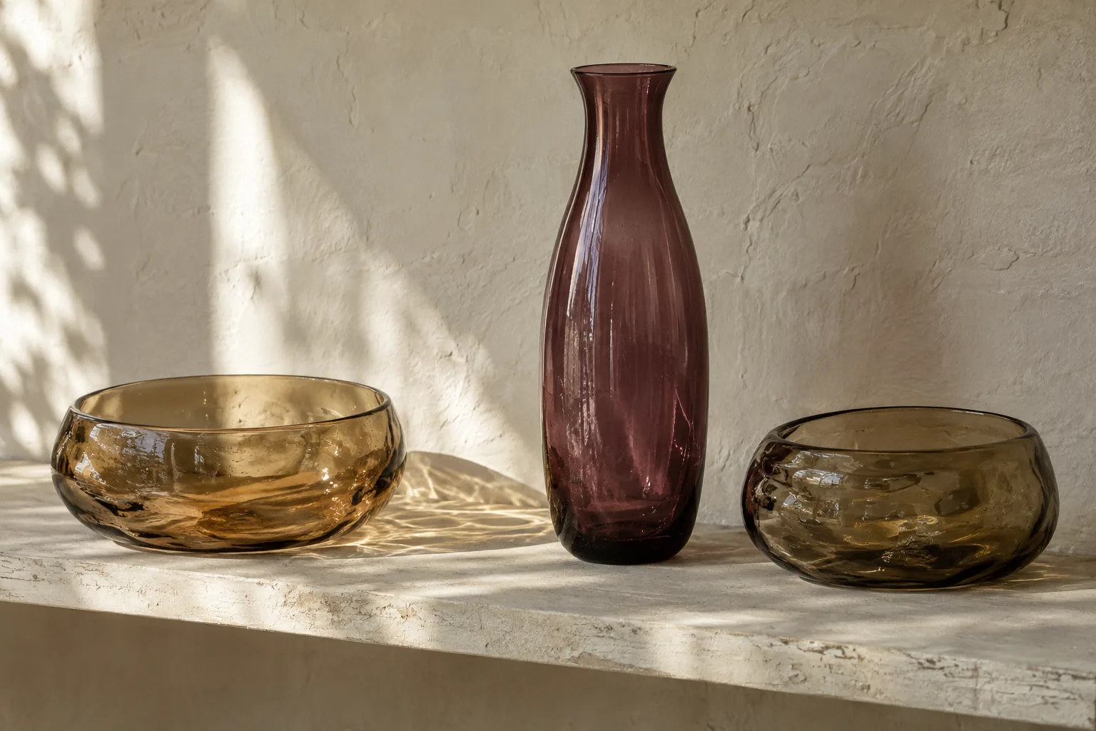
An amber bottle, a smoky green bowl and a clear vase can make a more interesting group than six near-matching amber pieces. The connection might be a muted quality rather than a single hue. Before buying more glass, put your existing pieces together and name what you like about them. Warmth, depth and pale watery colour are useful observations; a vague desire for a vintage look is less helpful.
Select one colour to carry most of the arrangement. Let a second appear once or twice. This is an editing device, not a rule about correct taste. It simply stops every appealing new find from becoming another permanent colour on the same shelf.
Account for changing light
Glass looks different against a window, a painted wall and a dark cabinet. Photograph your proposed location in the morning and evening, then compare it with the seller's photographs. A green that seems bright online might read almost black in an alcove. That could be beautiful, but it should be a choice.
A window ledge is not automatically the best place for every piece. Consider security, opening windows, blinds, temperature changes and whatever stands close by. You should not have to move a collection several times a day to use the room. A sideboard receiving gentle reflected daylight may give you colour without putting delicate objects in a busy spot.
Use opacity as another colour
Translucent glass, opaque glass and clear glass have very different visual weights. A small opaque piece can look more substantial than a much larger transparent bowl. If the display feels top-heavy, try moving that opaque object lower or towards the middle before changing anything else.
You can also use the wall as part of the palette. Pale glass against a white wall may feel subtle to the point of disappearing, while the same object against blue becomes much more definite. Test a large sheet of coloured paper behind the group temporarily. It is an inexpensive way to understand contrast before repainting furniture or buying a cabinet.
Avoid the colour-matching trap
Shopping for an exact shade can lead to disappointing purchases. Photographs depend on lighting, camera settings and your screen, and two vessels can seem to match until they stand together. A deliberate variation is often more forgiving. Look for a shared undertone or level of intensity instead of demanding identical green.
Ask the seller for a neutral daylight photograph when colour is crucial. Also request an ordinary view of the whole object, because seductive close-ups can disguise awkward proportions. Check condition independently of colour. A beautiful shade will not make a badly placed chip disappear, and no amount of rearranging improves a piece that feels unsafe to handle.
Leave one place unfinished
A convincing collection has room to breathe and room to change. Resist filling every gap with a tiny bottle. Smaller pieces can make a group look busy surprisingly quickly because each introduces another rim and another set of reflections. Try leaving one end of the shelf entirely clear.
For a simple starting arrangement, choose a low bowl, a taller vessel and one smaller object with an unusual outline. Stand back, move only one piece, and look again. When a future find arrives, replace something temporarily. Keeping a photograph of the previous arrangement makes it easier to compare results rather than assuming that more objects must mean a richer display.