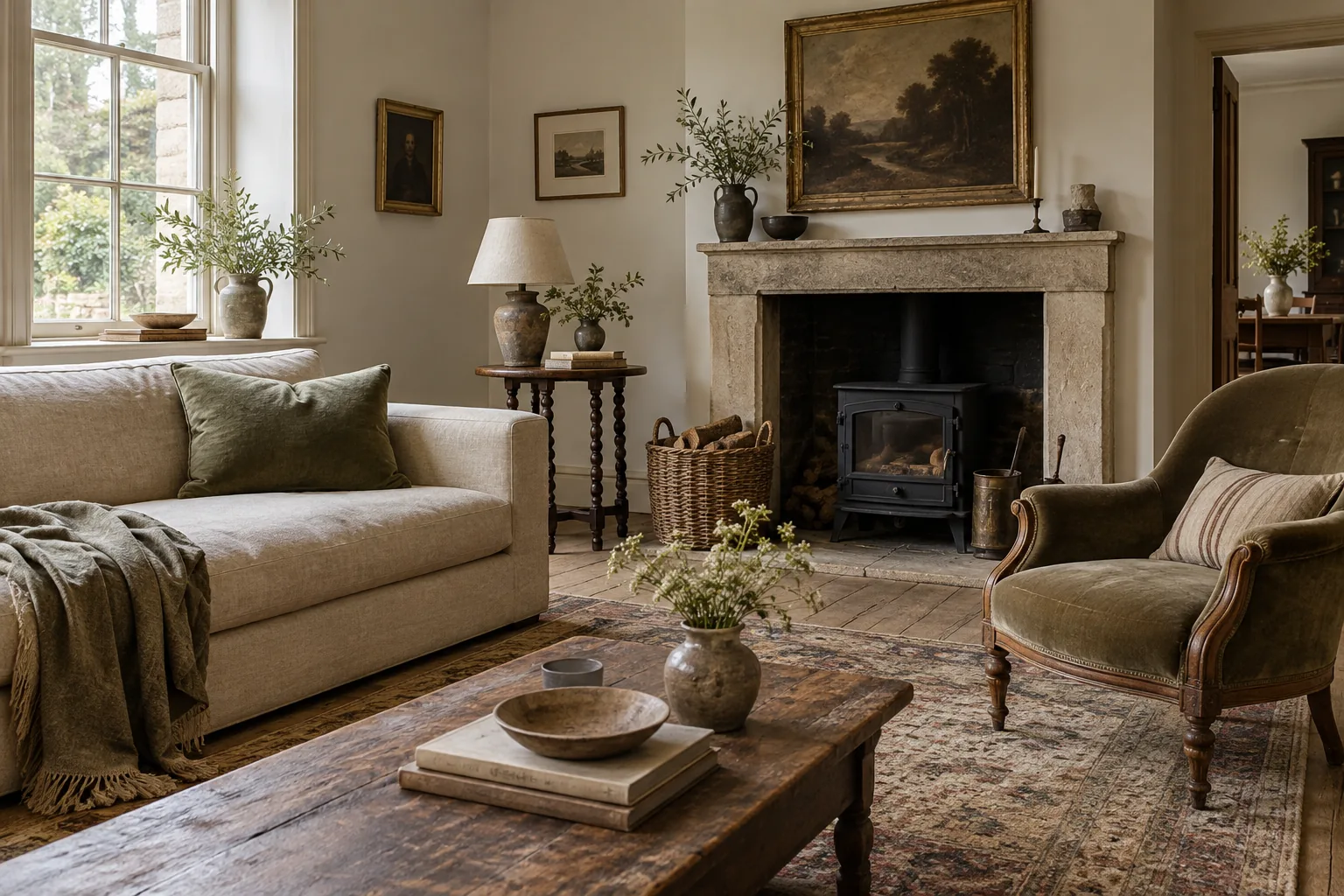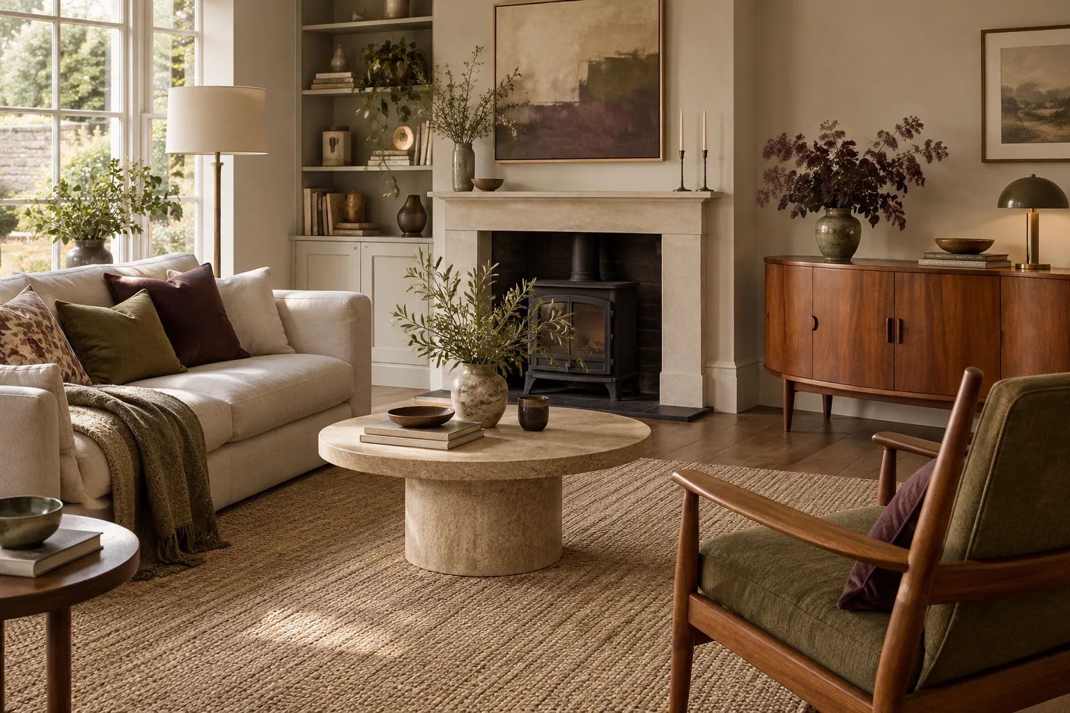
Look for colours you enjoy living with
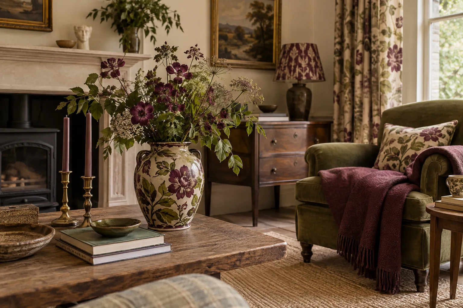
A favourite object can offer a more personal starting point than a ready-made room scheme. It might be a landscape painting, a glazed bowl or a patterned textile. Look closely at the colours that make you want to keep it nearby. The obvious dominant shade is only one option; a small patch of olive, a warm grey or a dusty pink may be the more useful colour for the room.
Choose an object for genuine affection rather than because it appears to contain a complete decorating palette. It is a prompt for decisions, not a contract requiring every colour in it to be reproduced.
Separate background colours from accents
Some colours are comfortable across a large area; others are more enjoyable in smaller amounts. Decide which shades from the object might suit the room's broad surfaces and which belong in a cushion, frame or vase. You may find that the quietest colour makes the best background while a stronger detail provides the accent.
Include what is already fixed in the room: flooring, large furniture and any finishes you intend to keep. A palette that ignores these elements will be harder to use. The aim is to connect the favourite object with the existing room, rather than pretending you are beginning with a completely empty box.
Test relationships in the actual light
Colours change in appearance beside one another and across the day. Put fabric samples or suitable paint samples near the furniture and object that inspired you, following product instructions for testing. Look in daylight and under the room's usual evening lighting before making a larger decision.
A shade that seems perfect on a screen may look very different beside warm timber or a cool floor. Pay attention to the relationship rather than chasing an exact match. A slightly quieter version of a colour may work better across a wall, while the original brighter tone remains a small, lively detail elsewhere in the room.
Repeat without scattering identical accessories
Once a palette begins to emerge, bring its colours back in different materials. A green in a picture might return in a woven cushion and a ceramic glaze, with each version slightly different. This creates connection without making the room look as though its accessories arrived in one coordinated package.
Leave some objects outside the chosen palette if they matter to you. A personal room can accommodate exceptions, especially when its larger areas have a clear relationship. Do not replace a useful or much-loved piece simply because it fails to repeat a colour from the starting object. The palette should help decisions, not narrow the room's life.
Know when the colour work is finished
A room does not need every shade represented equally. One or two recurring accents may be enough to make the whole arrangement feel connected. If you find yourself searching for an object solely to fill a missing colour, pause and look at what is already working. Empty space and neutral surfaces are part of the balance.
Return the original object to a position where you can enjoy it. It need not dominate the room or sit at the centre of every view. Its influence may be quite subtle by the end: a family of colours that feels familiar, held together by something you already wanted to live with.