Name the activities before the areas
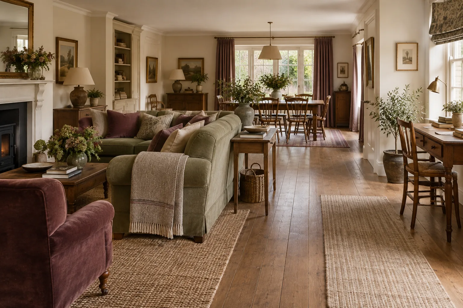
An open-plan room can feel strangely unfinished even when it contains plenty of furniture. Often the activities have not been given clear homes. List what regularly happens there: eating, reading, television, conversation or work. Then place the largest pieces around those activities rather than distributing them evenly along the walls. A vintage dining table can anchor meals, while a comfortable seating group defines the place to pause. The room does not need rigid boundaries, but it benefits from an arrangement that makes its different uses easy to understand at a glance.
Consider a room where the dining table also serves as an afternoon workspace. Giving it two jobs does not require two separate zones. It does require a nearby home for the work materials, so supper does not begin with a search for somewhere to put the laptop and papers. A suitable cabinet within easy reach may improve the room more than adding a dedicated desk that narrows the seating area.
Protect the journeys through the room
Draw an imaginary route between the doors and the places people visit most often. These paths should not cut awkwardly between a chair and its table or force someone through the middle of a conversation. Position larger furniture with these journeys in mind. A beautiful cabinet that narrows the route to the kitchen may create a daily irritation out of proportion to its size. Once movement feels natural, the zones often become clearer without extra partitions. Empty floor is doing useful work when it allows the whole room to function comfortably.
Use furniture backs with intention
In a large shared space, the back of a sofa or cabinet may be visible from several directions. Check these views before deciding where an older piece belongs. Some furniture was intended to stand against a wall and has an unfinished rear surface; that may affect where it looks settled. Avoid treating tall freestanding storage as an improvised divider without appropriate stability and restraint measures. Lower, suitable pieces can suggest a boundary more gently. The aim is to give an area an edge while retaining the openness that makes the room useful.
Before placing a console behind a sofa, measure the whole arrangement rather than the console alone. Its depth adds to the sofa's footprint, and any lamp or decorative object introduces a further activity in the circulation space. If the console is simply there to hide the sofa's back, try living without it first. A clean upholstered surface may be a more comfortable boundary than another layer of furniture.
Repeat a few details across the zones
Distinct areas still need to feel part of one room. Carry a small number of colours or materials between them, perhaps a dark timber tone at the dining table and in a picture frame near the sofa. The repetition can be subtle. There is no need for identical accessories on opposite sides of the space. Look for a balance between connection and variation: the dining area might be visually spare, while the sitting area contains softer textiles and more books. Shared details allow those differences to feel intentional rather than accidental.
Let rugs describe rather than dictate
A rug can help a seating group read as one place, but its relationship to the furniture matters more than an abstract rule about size. Look at where the chairs sit during use, where feet land and whether the edges interfere with a route. A rug beneath a dining table needs to work when chairs are drawn out, not just tucked in. If a rug makes movement less comfortable, the zone can be defined another way. Furniture orientation, a wall treatment or a simple change in the grouping of objects may be sufficient.
Review the room from several positions
Stand by each entrance, sit at the dining table and look back from the sofa. Notice whether one zone dominates the others or whether every surface is asking for attention at once. A quieter patch between arrangements can help the eye move through the room. Reduce repeated small displays before adding more furniture to fill perceived gaps. Open-plan living works best when the areas support one another: a place to eat, somewhere to settle and a clear way between them. Vintage pieces add character most effectively when this underlying arrangement already makes sense.
Make a second review while the room is in use. Ask someone to sit at the table while another person moves between the kitchen and sofa. Open the storage doors you reach for most often. Pull dining chairs out to their usual positions. A route that appears generous in an empty plan can narrow considerably once the furniture is occupied.
Look at sound and attention as well as movement. A workspace directly facing the television may be distracting even if the floor plan is tidy. Rotating a seat or desk can change what the user sees without creating a physical barrier. Those choices are personal, so test them before committing to heavy furniture. The room's success depends on how comfortably its activities overlap, not how sharply they are divided in a drawing.